Maps
Voting America encourages users to think about US political history by allowing two types of comparison. Animations of a single type of map--say, measuring the winner of presidential elections at the county level--allow for comparisons across time. Users can also explore a single election by looking at patterns across a number of variables, including the percentage of votes won by parties, the winner of a given district, or the distribution of votes across the United States.
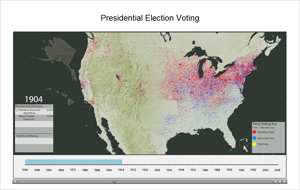
Animated Maps: Presidential elections, 1840 - 2008
Static maps on a page represent political change only with difficulty. Voting America sets American political history in motion. We juxtapose subtle pictures of the ways US voters have cast their ballots in presidential elections during the past two centuries. These animations, depicting more than forty presidential election cycles, reveal much about the gradual evolution and occasional sudden revolutions in American voting across the span of US history.
Animated Maps: Congressional elections, 1992 - 2008
Since 1992, the Congress has changed hands twice, from Democratic control to Republican in 1994 and then back to the Democratic Party in the midterm elections of 2006. These maps show how national political power shifted with the votes of a relatively small number of districts: control of places like Indiana's 2nd and 8th districts (around South Bend and Evanston, respectively) switched in both elections; in Minnesota's 1st and New York's 19th districts, among other places, members of the 1994 class of republicans were defeated in 2006 by Democratic opponents. The maps presented here show these unstable political regions as well as the large number of "safe" districts that have been created by state-level redistricting throughout the country.
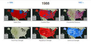
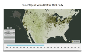
Synchronic Maps: Presidential Elections, 1840 - 2008
Maps that show which party won each state in any given presidential election are ubiquitous in American history textbooks. They can be powerful visualizations, showing some broad regional patterns in voting. Yet by reducing tens of thousands or even many millions of votes in each state to a single value they wash away much of the complexity of the spatial patterns in American voting. To reveal and examine that complexity, in Voting America we present a number of additional maps that present a more nuanced, granular, and subtle picture--or rather pictures--of the ways American voters have cast their ballots in US presidential elections during the past two centuries.
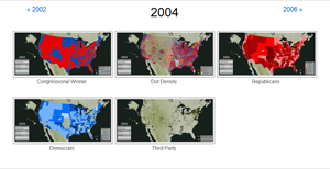
Synchronic Maps: Congressional Elections, 1992 - 2008
These maps bring together a number of views on recent congressional races: maps one might find many other places, such as the winning party in the 2008 election, combined with representations showing aspects of elections that remain hidden in most political maps: where, for example, have voters consistently voted for candidates outside the two main parties, and how close were elections over time? The multiple views offered here help to answer these and other questions about how Americans have voted for Congressional candidates since the early 1990s.
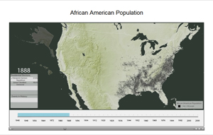
Population Maps, 1840 - 2008
Significant political change in the U.S. has often followed changes in where Americans were living. These maps allow users to trace large-scale national trends of the past, including westward migration, urbanization, and suburbanization, at a glance.